Rubber Ducky Unicorn

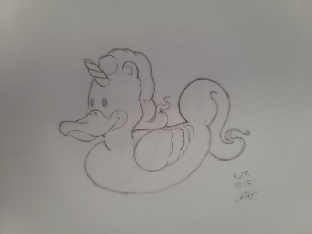
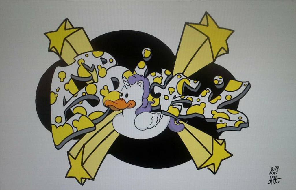
A client asked me to help with the design. He wanted a picture that would go on his daughter’s bedroom wall. I usually just locking myself up in a room and brainstorm on my own. But his fourteen-year-old daughter would not have it. The first thing I did was some research before sketching out a few different ways I could draw out her name. Surrounded myself with different images, I felt would inspire me. When I went over to talk to her father and discuss a different direction, I could go with the design, and I show him some of the pictures I had gathered for references. His daughter was continually asking questions. I asked her to make me a list of some of her favorite things in her room. She came up with unicorns, rubber duckies, the giant stars hanging from her ceiling. I also asked what her favorite colors were yellow and black. She was going through a goth stage. Taking everything she had listed for me I ran it through the mill in my mind and came up with several sketches and designs.

Although I am used to working alone, I do have quite good people skills. I enjoy getting input from people, and I work well with others. I just have to remind myself of it sometimes. I did not get aggravated with his daughter wanting to feel involved. The design will be something she is going to be looking at every day. Instead of getting a worked up about her interrupting my process, I invited her input. In my research, I found a rubber ducky unicorn that she loved. I integrated into the design. If I had not asked her for a list of her favorite thing may have totally bypassed the rubber ducky unicorn.

Funky Parrot

I have always thought of myself as an illustrator first. When I was asked to help redesign the logo for a company called the Funky Parrot, I wiped out my trusty pencil and paper and went work—surrounding myself with reference illustration and photo that supported my style. After some work, I came up with a design that I felt was both distant and unique. Aftershow a few of my peers and receiving feedback, I was told that my design was to complicate. Taking their advice and insight into consideration, I went to work on the redesign.

Normally I would start work on my own. Somebody would tell what they wanted I draw it, job done. I understand that if I am going to grow as a business and as an artist, I need to concede other people’s verbal input. That is one of the reasons I decided to go back to school. There is only so much you can see and learn on your own. My weakness was my greatest strength growing up. The same determination the help me push through roadblocks is part of what is holding me back.  You can give me a job with a little guidance and work it on my own and deliver the best I have to offer. But that is not always what the job requires.

My school has helped me get a better understand of programs like Adobe Photoshop and Adobe Illustrator. They have given the push I needed to get a better grasp of color theory. The most important thing I learned was how to work with people, and not all feedback is bad.

The finished design was a little out of my comfort zone. Honestly, I do not think I would have come up with it on my own.

Wild Bill

When I got the Wild Bill hot sauce, all I was given was a black and white outline of the log and some instructions. The first thing I did was convert the logo into a vector version. This would allow the Wild Bill logo to become more without losing resolution. Taking into account the natural colors for the logo, I got to work on building a mood board. I wanted to find colors that felt like an old western. The Wild Bill logo had a slight Clint Eastwood feel. I did not see any reason why I should not build on that. Some of the images I gathered for the mood board were of the ingredient. I did not think of it at the time of collecting the photos, but I realize that I could use some of the images on the packaging. An earth-tone tan seemed like a natural choice in hindsight, but trying to steer away from the obvious can be a problem within itself. It can get a little frustrating, wanting the product packaging to look natural but not get lost on a crowded shelf. I think part of the struggle is not wanting your work to feel like everybody else. Balancing your artistic flair with what the product calls for and need can be a constant act of steering and re steering the ship.

There is also the necessary information that goes on every label. I was given a website where I could find a list of what needed to be on the label, and the company provided me with the other information that needs to be on the product packaging. There is a need to concede the proper spacing between information and logo. It’s easy to think of throwing everything on the paper, and it should be fine. To close, and the information will blend in with each other. Also, keeping things aligned helps product packaging flow smoothly.

Aqua Excursions

Aqua Excursions contacted me to redesign their pamphlet. Like previous jobs, I was given the information that needs to go into it. Along with the necessary information, I was given a few photos and a raster image of their logo. My first instinct was to jump into the redesigning of the pamphlet, but there were a few things I needed to do first. In order for me to use the logo reliably, It was going to have been converted into a vector. On top of this, some of the photos were not the right size. In the prosses of resizing the images, I saw that some could not be resized without the loss of quality. Consulting with Aqua Excursions, I resized the pictures that were needed for the brochure.  I also sat down and read over the information they gave me to put in the booklet. I need to see if there were any spelling errors I could catch. Later on, l ran it through Grammarly.

The colors I have chosen were chosen to suggest the mood of an of a quiet evening, that moment between sunset and nightfall. I felt that it was the best image to suggest a “quiet moment for you and the family.” I wanted the pamphlet to catch a person’s eye from across the room, not accosted them. My goal was to suggest some of the activities and sights that their guest may enjoy during their stay.

Finding the right balance between the images and the words was a little challenging. I did just want to place the pictures along the top and bottom like every other pamphlet. I was laying out the information a way that flowed naturally again, not wanting to over while the reader. I enjoyed working on this project. Having to think about how to best lead the reader’s eye while being informative was fun.

CMS And Plugins

CMS is a content management system; it is an application that can be used to modify digital content and Mange its creation. A CMS takes all the moving parts that are needed to make a website work and brings them all together.

While WordPress is a very flexible and powerful tool, it has its limits. This is where plugins come into play. A plugin helps add extra factuality to your website. Things change all the time technology is the same. But with the internet, it feels like it is moving a little faster. You cannot expect that every website runs every latest program and feature or stay updated with the last minute it is introduced. A plugin helps you stay up to date and use some of the features other websites may have. This way, you can add that new trick you saw some on another site. Plugins can also you stay organized or keep track of number as they come across your website. If there is a feature you like to try on your website, odds are somebody has developed a plugin for it.

I wanted them that could display my work quickly. Anybody who visits my site should not have to dig around and to try to find a sample of my work. If they see something they like or are just wanting to know more about it, they can click on the image. They would find more samples of whatever style interests them. I like that I can link my social media to the top of the site. I know that some employers may find it difficult to navigate social media; the links would make it easier for them to see my profiles and keep track of what I am doing if they choose to. I want my website to feel easy to use from the moment they open up my site.